Publishing Insights
What Cover Design Communicates Before a Reader Opens the Book
July 2, 2025 · 6 min read
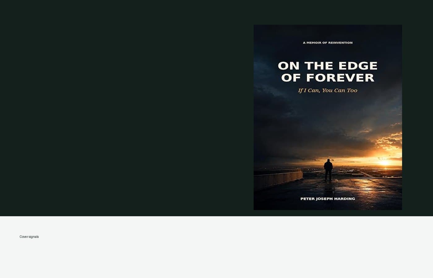
Readers make cover judgments in fractions of a second, especially in digital storefronts. A strong cover does not explain the entire book. It signals genre, tone, and quality with restraint.
Typography often matters more than illustration. Letterforms carry mood: quiet literary fiction asks for different type decisions than narrative nonfiction or poetry. Color and composition should survive shrinking to a phone-sized thumbnail without losing identity.
At Quillstone Publishing, cover exploration begins with comparable titles and emotional register, not decoration. The goal is recognition: this book belongs in a conversation the reader already understands, while still feeling distinct.